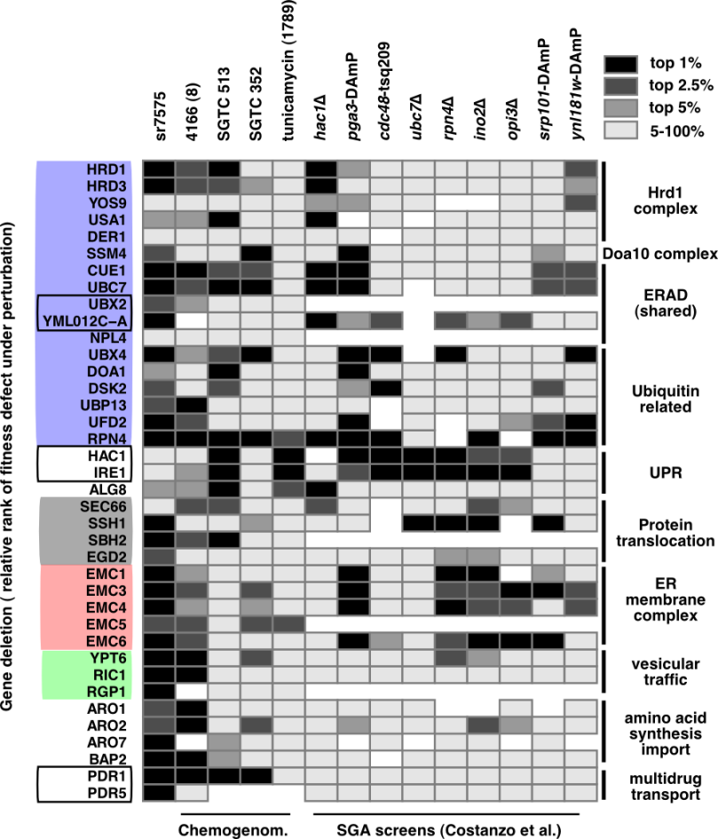
The following fragments of R code illustrate one of the ways of showing quantitative data through a custom heatmap. For this example, I will be using a table of results containing growth changes observed under various conditions for yeast deletion gene mutants (published available data sources). The complete table, “selected_screens_top50_etal20150410raw.csv” can be downloaded from github.
1. Prepare a dataframe from tabular data:
read.csv("selected_screens_top50_etal20150410raw.csv", stringsAsFactors=F)
names(thedata)
# [1] "X" "ORF" "Long_description" "haploids_SR7575_exp1" "haploids_SR7575_exp2"
# [6] "avghaplo" "rank1" "rank2" "Gene" "SGTC_352"
# [11] "SGTC_513" "SGTC_1789" "CDC48_YDL126C_tsq209" "CDC48_YDL126C_tsq208" "RPN4_YDL020C"
# [16] "INO2_YDR123C" "SRP101_YDR292C_damp" "HAC1_YFL031W" "OPI3_YJR073C" "PGA3_YML125C_damp"
# [21] "UBC7_YMR022W" "YNL181W_YNL181W_damp" "X4166_8_HOP_0148"
2. Define the function that will categorize the data nicely:
This function takes a vector of numerical values and returns, for each value, a category, that can be customized, via breaks and their associated labels. The important library here is scales, which does all the magic.
library(scales) #required for the rescale function
rank_pc <- function(vect, brks, labls){
    rks <- rank(vect, na.last="keep")
    #example breaks = c(-1, 0.1, 0.3, Inf), labels=c("lo", "mid", "other")
    endclass <- cut(rescale(rks), breaks = c(brks, Inf), labels=labls)
    #rescale(rks) just changes the ranks from 1:4000 to 0:1 interval
    #it becomes thus very easy to pick, with the "cut" function,
    #the intervals we want
    return(endclass)
}
3. Massage the data to get a reduced set just for the plot:
cut_data <- lapply(thedata[,c(6, 10:13)], rank_pc, c(-1, 0.01, 0.025, 0.05), c("01", "025", "05", "other"))
cut_df <- data.frame(cut_data)
cut_df$ORF <- thedata$ORF
cut_df$Gene <- thedata$Gene
#rearrange columns
cut_df <- cut_df[, c(6, 7, 1:5)]
summary(cut_df)
# ORF Gene avghaplo SGTC_352 SGTC_513 SGTC_1789 CDC48_YDL126C_tsq209
# Length:4909 Length:4909 01 : 50 01 : 41 01 : 41 01 : 41 01 : 30
# Class :character Class :character 025 : 73 025 : 60 025 : 60 025 : 60 025 : 45
# Mode :character Mode :character 05 : 123 05 : 100 05 : 100 05 : 100 05 : 74
# other:4663 other:3812 other:3812 other:3812 other:2823
# NA's : 896 NA's : 896 NA's : 896 NA's :1937
Select the ORFs of interest (or the genes, whatever):
goodorfs <- c("YOL013C", "YLR207W", "YDR057W", "YML029W", "YBR201W",
"YIL030C", "YMR264W", "YMR022W", "YML013W", "YML012C-A", "YBR170C",
"YMR067C", "YKL213C", "YMR276W", "YBL067C", "YDL190C", "YDL020C",
"YFL031W", "YHR079C", "YOR067C", "YBR171W", "YBR283C", "YER019C-A",
"YHR193C", "YCL045C", "YKL207W", "YGL231C", "YIL027C", "YLL014W",
"YLR262C", "YLR039C", "YDR137W", "YDR127W", "YGL148W", "YPR060C",
"YBR068C", "YGL013C", "YOR153W")

goodorfs_df <- data.frame(goodorfs)
goodorfs_df$order <- row.names(goodorfsdf)
#we will need the order later to keep them exactly as needed!
cut_subset <- cut_df[which(cut_df$ORF %in% goodorfs),]
#38 observation of 7 variables
toplot <- merge.data.frame(goodorfs_df, cut_subset, by.x="goodorfs", by.y="ORF", all.x=T, all.y=F)
toplot <- toplot[order(-as.integer(toplot$order)), ]
#reversed order, because the y axis grows from top to bottom (the first that we want will be on top)
toplot_simple <- toplot[, c(3:8)]
4. Define and use a plot function with some bells and whistles:
library(grid) # for unit function
library(ggplot2)
library(reshape2)
plotheat <- function(mydf){
    #the data frame has the first column called 'Gene'
    #all the other columns are categorical
    nms <- names(mydf)
    lnms <- length(nms)
    rowsall <- length(mydf$Gene)
    colsall<- length(names(mydf[, c(2:lnms)]))
    rowIndex = rep(1:rowsall, times=colsall)
    # 1 2 3 ...
    colIndex = rep(1:colsall, each=rowsall)
    # 1 1 1 ...
    mydf.m <- cbind(rowIndex, colIndex ,melt(mydf, id=c("Gene")))
    p <- ggplot(mydf.m, aes(variable, Gene))
    p2 <- p+geom_rect(aes(x=NULL, y=NULL, xmin=colIndex-1,
    xmax=colIndex,ymin=rowIndex-1,
    ymax=rowIndex, fill=value), colour="grey")
    p2=p2+scale_x_continuous(breaks=(1:colsall)-0.5, labels=colnames(mydf[, c(2:lnms)]))
    p2=p2+scale_y_continuous(breaks=(1:rowsall)-0.5, labels=mydf[, 1])
    p2=p2+theme_bw(base_size=8, base_family = "Helvetica")+
    theme(
        panel.grid.major = element_blank(),
        panel.grid.minor = element_blank(),
        panel.border = element_blank(),
        axis.ticks.length = unit(0, "cm"),
        axis.text.x = element_text(vjust=0, angle=90, size=8)
    )+
    scale_fill_manual(values = c("black", "grey30", "grey60", "grey90"))

return(p2)}

plotheat(toplot_simple)
ggsave("myniceheatmap.pdf", width = 18, height = 15, unit="cm")
The result, after some polishing with Inkscape: